colored Forms
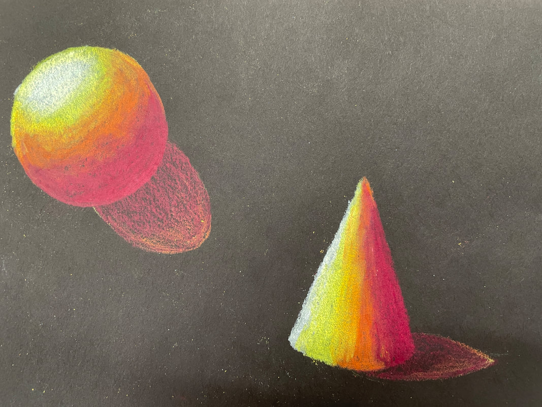
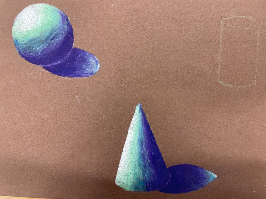
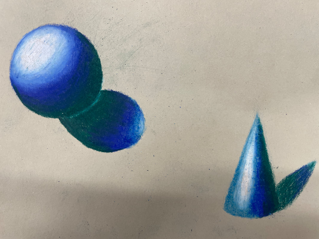
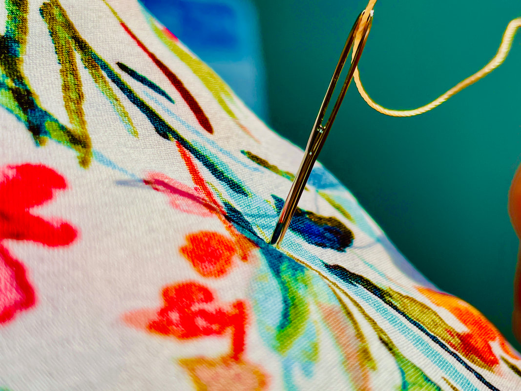
For this assignment, we had to draw a sphere and a cone on three different colored pieces of paper using prisma colors. I used red, orange, and yellow for the shapes on the black piece of paper; I used teal, light blue, and dark blue for the shapes on the brown piece of paper, and I used light blue, dark blue, and dark green for the shapes on the grey piece of paper. Colored value charts For this assignment, we had to create two eight-step value charts using two different prismacolors. I chose to create my value charts on a grey piece of paper using a blue prismacolor and a red prismacolor. Colored fruit For this project, we had to create a fruit or a veggie using prisma colors. I chose to draw a pear, and I used various shades of green along with blues and browns to create the highlights and shadows. Reflection projectFor this project, we were to create a prisma colored drawing that had some form of a reflection of ourselves in it. I chose to use sewing materials as a reflection of myself, and the final idea I went with for this project is idea #1. Brainstorming
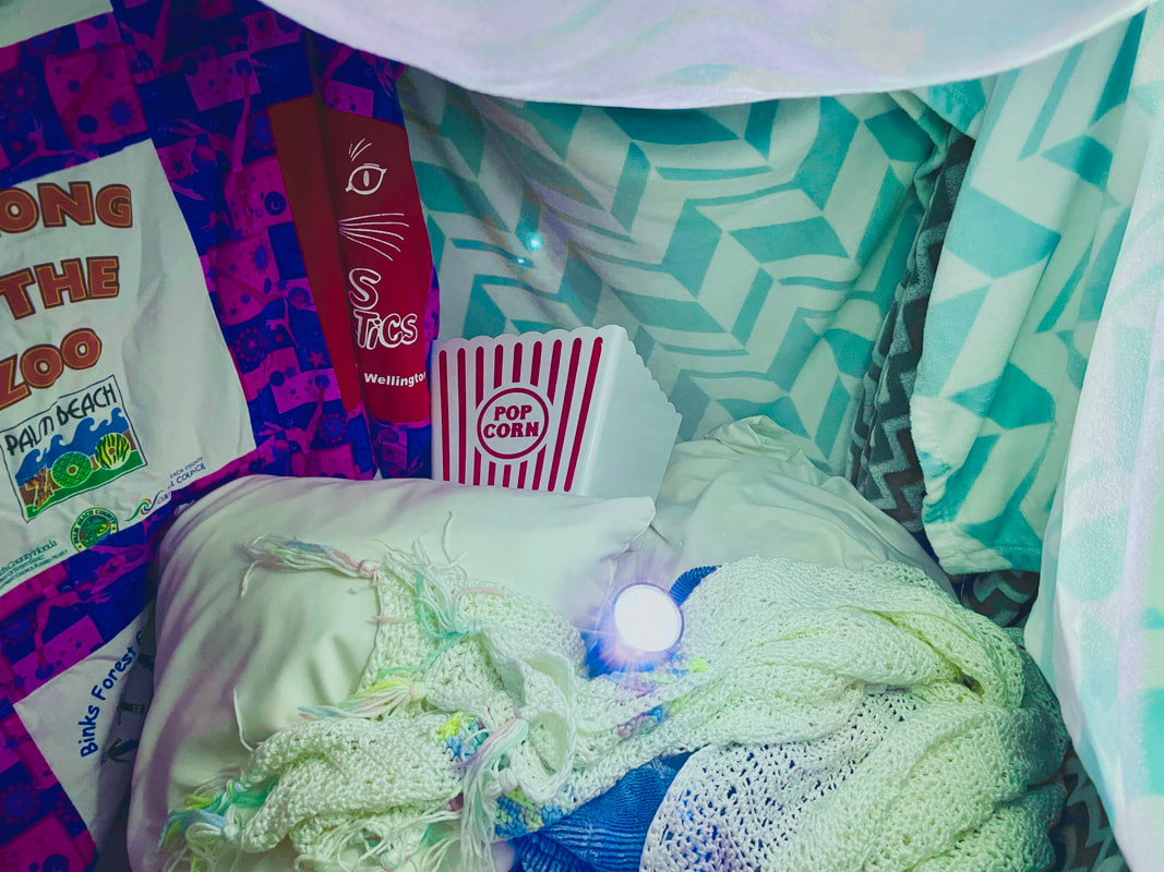
Compositional photos: idea #1
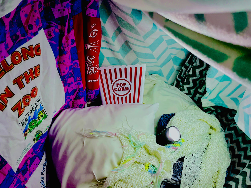
compositional SKETCHES: idea #2
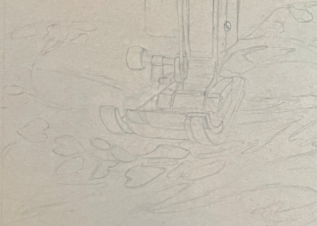
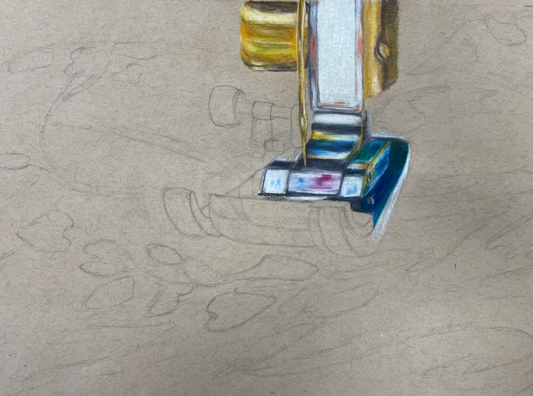
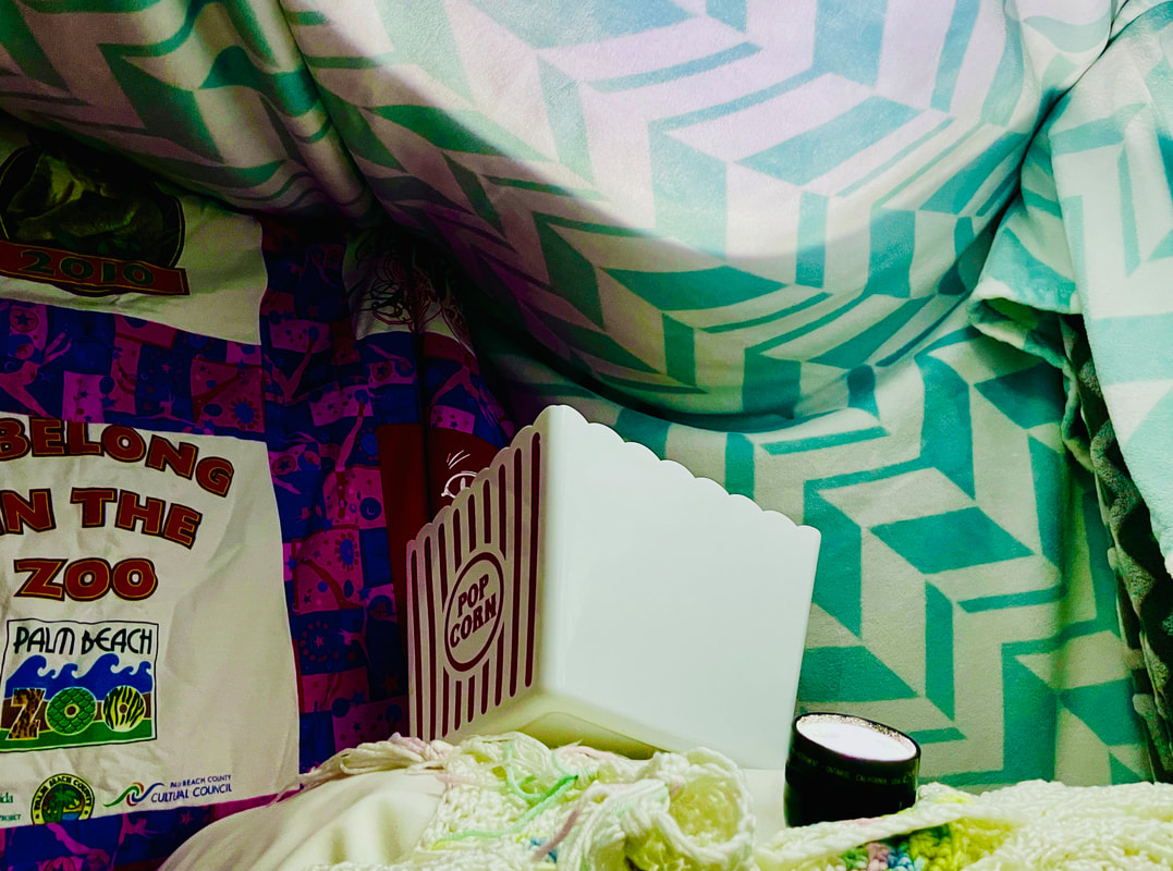
Colored SKETCH In progress photos
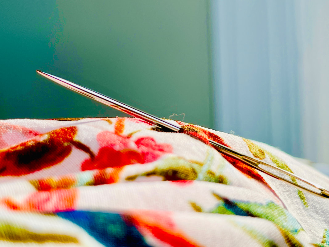
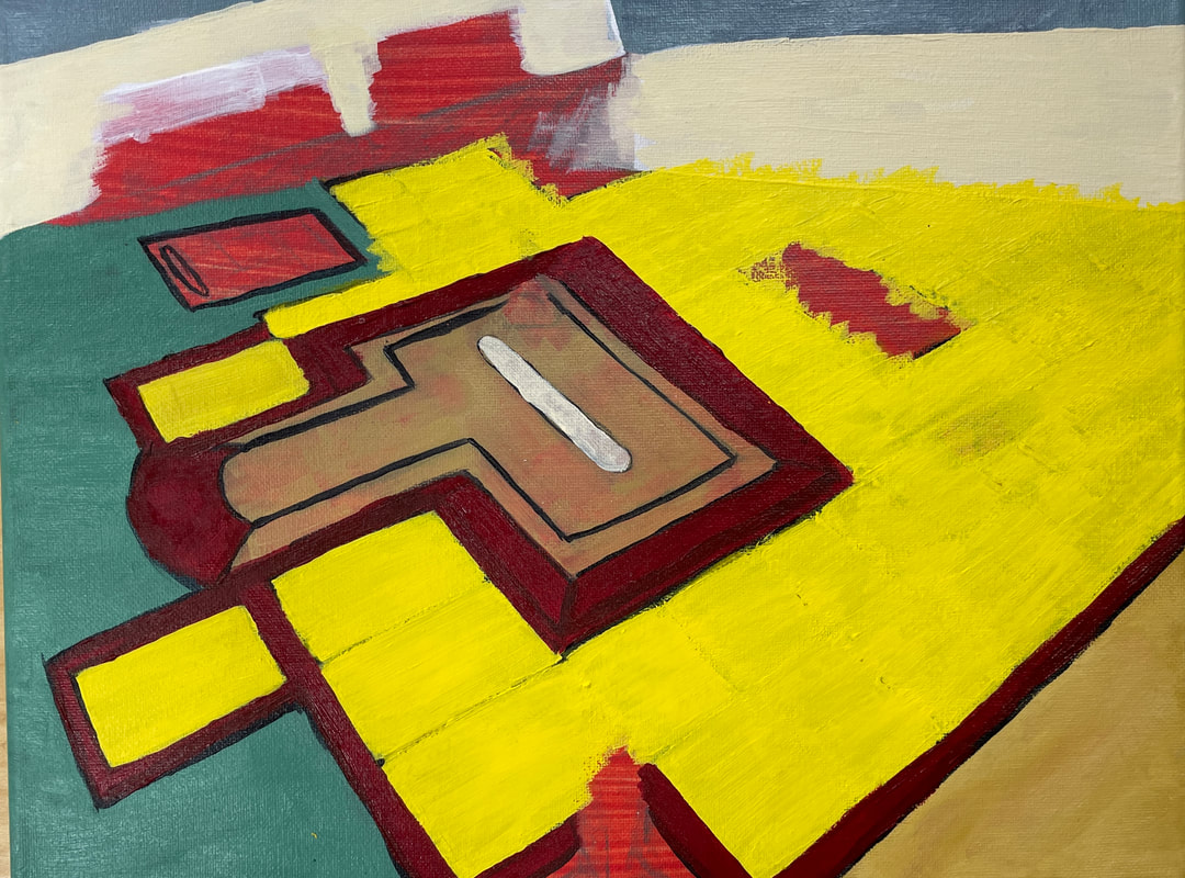
final colored SKETCH ReflectionThis project was a representational reflection of myself. I knew that I wanted to use an object used to sew because sewing is something that I really enjoy and it represents me well. In order to brainstorm for ideas, I looked for items that I use for sewing and looked to see if I would be able to get a reflection out of it. For my first idea, I used the metal and plastic in the foot of the sewing machine to create a reflection. For my second idea, I used the metal in the hand sewing needle to create a reflection. The choice of fabric that would reflect into the object was also an important consideration for me. I wanted to use an interesting pattern with a lot of color to create a unique art piece. The specific piece of fabric that I thought fit this description was also the same pattern that I used to create a dress in apparel II, which I finished right before the shutdown. For the process I went through to create this piece, I started with a sketch, then started coloring in the foot of the machine, then moved to the background and pattern of the fabric. Some successful things about this piece were that I was able to get the colors as vibrant as my reference photo, and the reflection of the colors into the foot of the machine turned out really well. Some challenges that I faced while creating my piece were initially making my sketch too small. In order to fix this, I expanded the size of the foot so that it would fit the composition of the piece better. Overall, using prisma colors for this project went really well. I learned how to blend and layer the colors to get the vibrant look I was trying to create, and I learned to test out the colors on the colored paper before using them in my piece. I think this is one of the better artwork pieces I have created so far, and from this I have learned to choose things that matter to me. I think choosing to draw something that is important to me helped me focus more on creating a piece that I am proud of. Overall as an artist I grew my realism skills in drawing. I really tried to emphasize the highlights and shadows to give the piece depth and this helped me improve my skills. color wheel
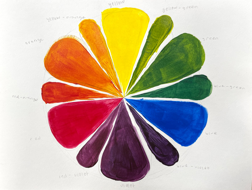
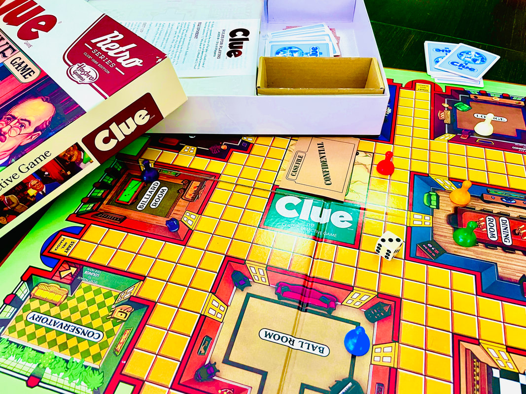
For this project, we had to create two different color wheels with different colors of red, yellow, and blue. practice painting This project was our practice painting for our interior spaces project. I chose to paint a butterfly and I like the details on the wings, but I did not have enough time to paint the flowers and plants in the background. Interior Spaces projectFor this project, we had to use acrylic paint to create an interior space painting. I chose the board game idea, and I took some pictures of the board game CLUE. Brainstorming
compositional sketches idea #1

compositional sketches idea #2
final color sketch in progress photos
final painting ReflectionThere were a lot of different ideas I had for this project, but I went with the board game idea because my family plays CLUE a lot and I thought I could create a really interesting photo. I liked this idea the best because of the point of view I took the photo from. I thought it was a really interesting perspective to take the photo from the player's point of view, and I really liked all of the details in the game board. I didn't learn how to use acrylic paints and I haven't painted anything in a while, so this project was difficult for me to begin with. I struggled with finding colors that I liked. I was also having a difficult time getting the lines straight and thin. There were also a lot of small details that I would have liked to include if I could have painted it. With this piece, I started with a red-wash underpainting, then a sketch, then I started with the yellow on the game board and I worked my way towards the top of the painting. One of the challenges I faced was time. I thought I could have done a lot better of a job if I had more time to pay attention to the details, but I was already so far behind that I had to rush through. Overall, I was happy with the colors I used in the painting, especially because the tone of the yellow took a long time to figure out. With this project, I learned how important an underpainting and sketch is for acrylic paintings. I think I improved on my painting skills and I will know for next time how to mix the colors to get the shade I want. Colored eye This project is the colored eye practice drawing I did following along with the "do's and don'ts of drawing the eye" video. colored nose This project is the colored nose practice drawing I did following along with the "do's and don'ts of drawing the nose" video. colored mouth This project is the colored mouth practice drawing I did following along with the "do's and don'ts of drawing the mouth" video. Facial Features Placement This project is the facial feature practice drawing I did following along with the "facial features" video. Eye Painting This project is the acrylic eye practice painting I did following along with the "how to paint the eye" video. Acrylic Skin Tones These are the practice skin tones I created using the three primary colors in acrylic paint. Self portrait projectBrainstorming ideas Final sketch In progress photos
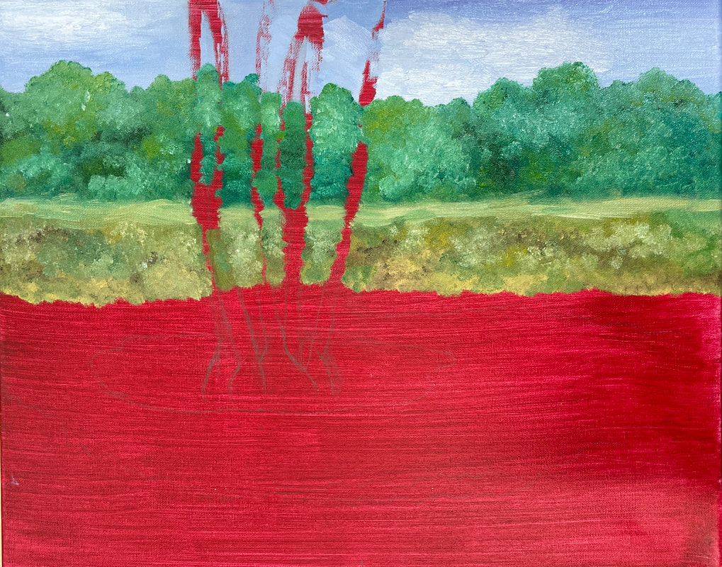
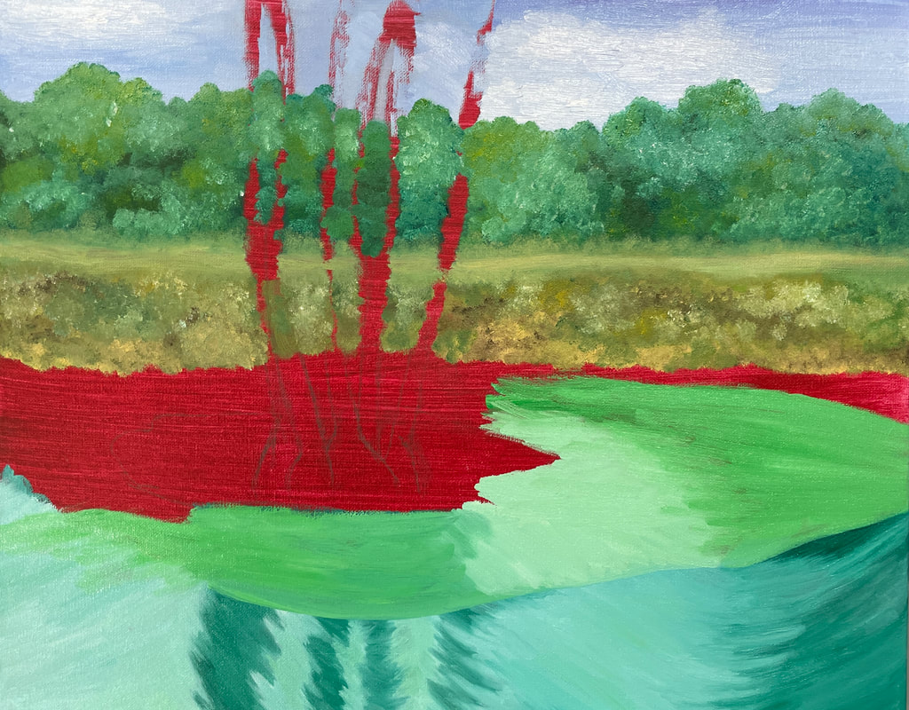
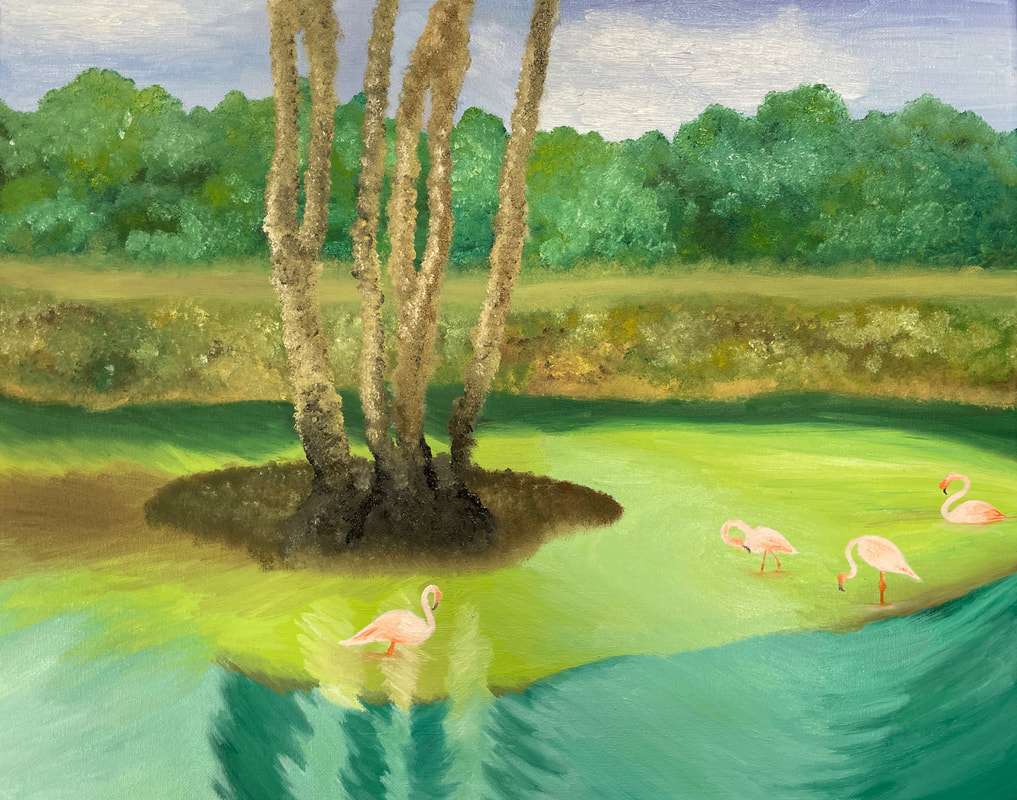
final painting ReflectionFor this project, I found a lot of different portrait painting inspirations. Originally, I wanted to create something more abstract, but I found other realistic references that I liked better. I chose this idea specifically because I liked how the portrait showed more than just the face, and how the torso blended in to the background. There were many challenges I faced while creating this artwork. It was difficult for me to blend out the skin so that there would not be any harsh lines. I also struggled with blending out the torso into the background because I wanted it to look like a smooth transition. Something I think I did well on this painting was getting the proportions correct on the face and adding in the shadows and highlights. When I was creating this piece I started with a red underpainting wash and then I drew the outline. Then I painted a base color for the skin, hair, and clothes before I added in all of the details. I struggle with painting in general, but I think that doing the interior spaces project first helped me learn how to use acrylic paint so I could be more successful on this project. For this painting, I learned how to blend the acrylic paint in order to eliminate the harsh lines. This was my first time painting a self-portrait and I was able to use some of the techniques from drawing a self-portrait in this painting. For my future projects, I learned that blocking in the main areas of my painting helps me keep the proportions correct. I think that learning how to blend the paint is something that helped me grow as an artist, and this will help me in future paintings I create. 100 colors challenge This is the 100 colored squares challenge where we used red, yellow, blue, white, and black to mix 100 different colors with oil paint. practice oil painting This is the practice fruit/veggie oil painting for this unit. This was my first time using oil paint, and there were a lot of things I learned about the medium while making this painting. Practice PALETTE knife painting This is a practice palette knife painting using oil paint. The subject of this painting was an apple, and it was my first time using a palette knife to paint. landscape oil paintingbrainstorming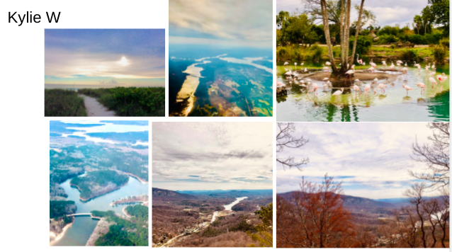 Colored sketch in progress
final painting ReflectionTo brainstorm for this project I looked through all of the landscape photos I had in my camera roll, and I chose the most vibrant and interesting pictures. I chose to use the painting with the flamingos in it because I liked all of the colors in the water and how there were multiple levels in the ground. This was my first time painting a landscape scene, and I found it difficult to choose a place to start. I decided to start with the sky and then work my way down because I didn't want to smudge the paint since the oils dry slowly. Doing the practice paintings in oil really helped when it came to this final project because I understood how to layer the paints to get the brightness I was going for. I also had to plan out which sections I was going to paint. For example, I painted the flamingos on top of the paint I put down for the water, so I had to plan my time accordingly to make sure that the paint would paint would be dry and that I also had another section to work on. I found it difficult to add some of the darker layers into my painting. Overall I like the tones in the colors and I think that there is a nice brightness to the piece. However, I would have liked to add more of the darker shadows in to show the depth of the land. When I started my painting, I was worried about how the flamingos would turn out, but I think that they turned out really nice in the end. I also like how each shape is different and each color has a slight variation to it. With this project, I learned that I like oil-paint a lot better than acrylic painting because of how much time there is before the paint completely dries. I also learned how to plan out my artistic process before I start painting, and how this helps me while I am creating my artwork. I think that this is one of the more successful paintings I have done so far, and there were a lot of techniques I learned throughout this project that I will use in future artworks. Art 4 Class reflectionOverall I really enjoyed Art 4. I learned to use mediums and techniques I had never experimented with before, and this helped me improve my abilities as an artist. I also feel like I have grown more as an artist in Art 4 than in previous art classes because of how much thought/planning went into each project. My favorite project to work on was the Reflection Project in prismacolor pencil. I was really liked how broad, yet specific the requirements were for choosing something that reflects yourself and that has a reflective quality in it. I was also really happy with how this piece turned out, and I learned that prismacolors are one of my favorite mediums to work with. Prior to Art 4 I didn't have a lot of practice with painting, so the first few painting projects we did were challenging for me. I liked that we were able to use both acrylic and oil paints because it helped me recognize the characteristics and functions of each type of paint. This will be especially useful for AP next semester because I will have enough knowledge about each type of paint in order to pick the one that would best work in a piece of my portfolio. I liked doing multiple paintings throughout the class because I was able to see my growth as an artist through each painting. The last painting we did in Art 4 was a lot easier for me to complete than the previous paintings because I understood the process/techniques needed to create a successful painting, and how these are different from using prismacolors. Although I was able to improve on a lot of things as an artist in Art 4, I would have liked to experiment with more mediums, for example charcoals or pastels, because I feel like I could have learned more techniques that would help me grow as an artist. This semester has also taught me how to plan out my entire artwork in my sketchbook before I start, so that I have a clear vision of what the end product will look like. This process really helped me brainstorm better ideas along the way, and I was able to come up with more interesting subjects and compositions after planning out my project better.
0 Comments
|