4 ASSESSMENT drawings
For these 4 assessment drawings, we had to draw 4 different scenes to the best of our ability using pencils, paper, erasers, and rulers. The first drawing is of a pair of shoes with laces that I took a picture of. I positioned the shoes in a way that I thought would be more visually appealing than if it were just an overhead view. The second drawing is a picture of myself that was taken when we were waiting in a line at Disney. The third drawing is a city street that I did based off of a picture of a city I found. The fourth and final drawing is of my left hand that I drew based off of a picture I took for this project. Value Forms
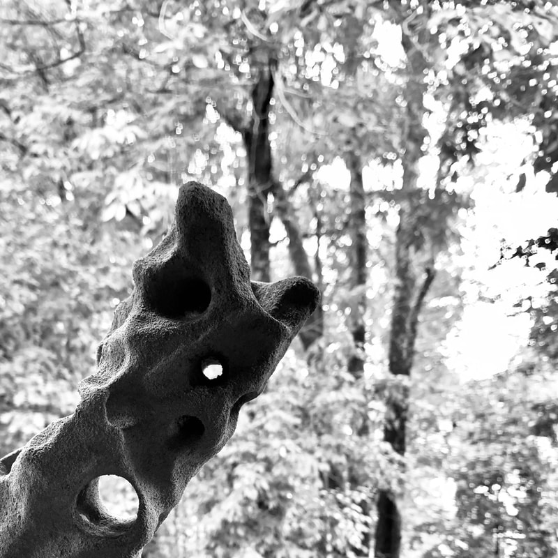
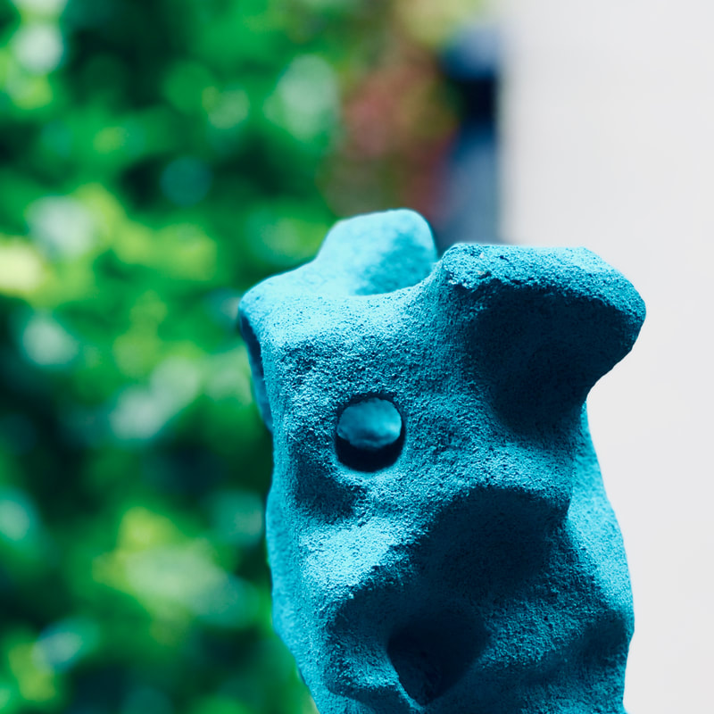
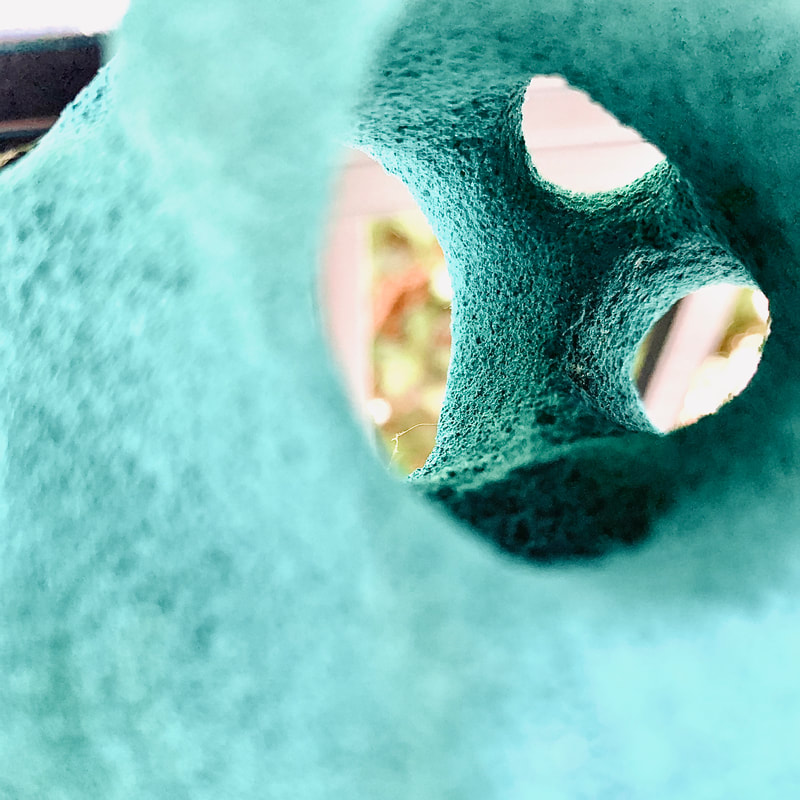
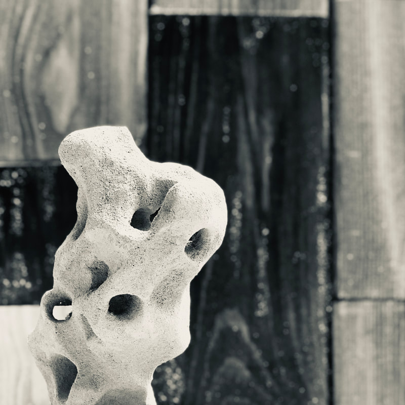
Photo Composition
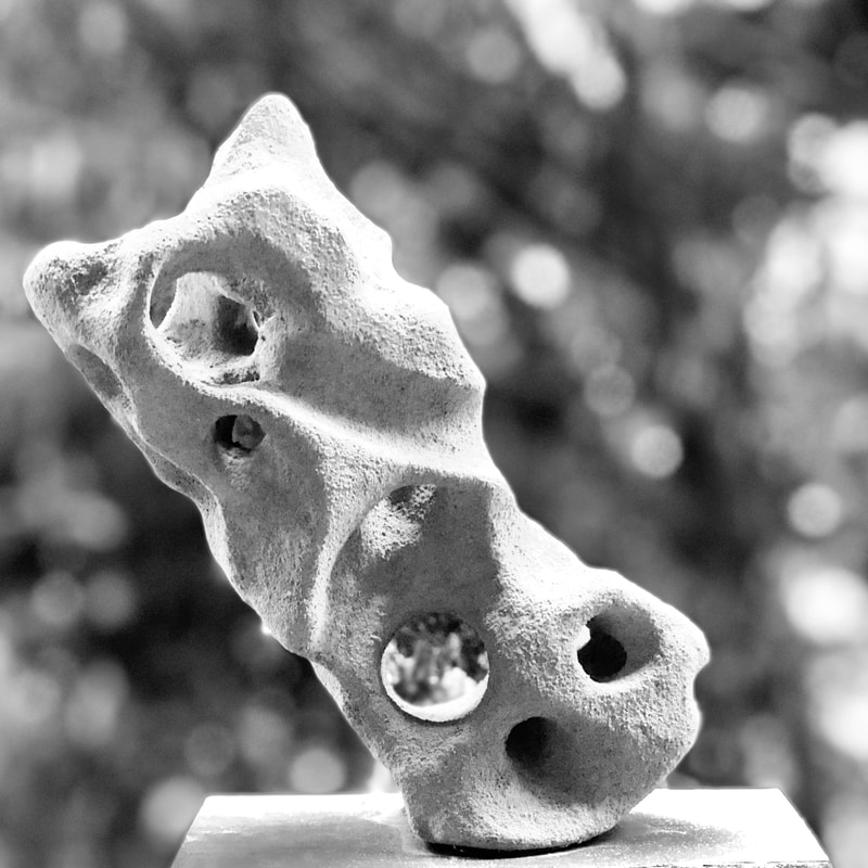
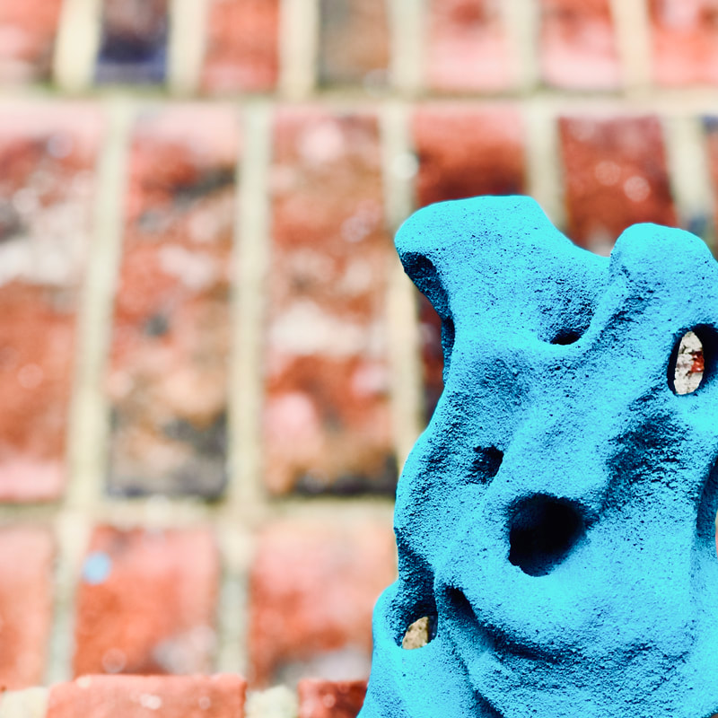
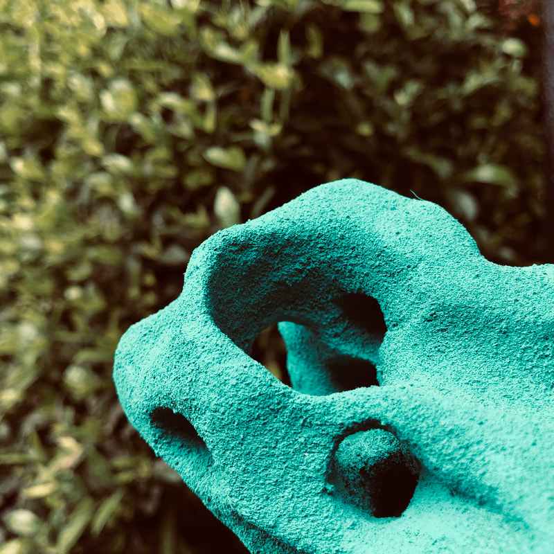
For this project, I chose to photograph a foam sculpture I made. I chose various places outside as a background, and I utilized the grid feature on my phone for the rule of thirds. I then edited the photos, changed some to black and white, and cropped them into squares. Three Photo Seriesfinal photos
Written sectionDescribe: My piece is about the start of the school year and how different it is compared to normal. The first photo is of my laptop, with textbooks and school supplies next to it. These items are on the couch that is outside on our back deck. The middle photo is of an Apex mask next to hand sanitizer sitting on the railing of our deck. The third photo is an image of my dog next to the couch where I took my first photo. This type of art is about creating images that are aesthetically appealing to the eye. By using techniques, like the rule of thirds, and editing tools like cropping and filters, composition photos can create beautiful and appealing images. Analyze: In the first image, the lines created by the railing in the background draw your eyes to the center post. This line continues down the center of the image, emphasizing the items found at the bottom. In the second image, the line of the railing draws your eye from the left side of the image, down to the right side of the image. This follows the path from the first image to the third image. Finally, in the third image, the straight lines of the couch create the corner where my dog is sitting, which is similar to the effect in the first image. The three pieces are connected by an overall unity of the environment they are in. All of these images take place in our backyard, so they all have the same color scheme. In addition to this I also used the same filter on all of the photos to make them look like they are all one series. Interpret: The idea behind my piece was that our life today looks a lot different than what we are use to. I was inspired by the trees in my backyard since they have a beautiful green, in contrast with the warm brown color of the wood. This is seen throughout all three photos, since they all contain the trees and the wood I see in my backyard. I was able to show how our life is different than it was by adding in our new form of school. In the first image, all of my school supplies are present, and I show how we currently go to school (laptop). This is significantly different than the type of learning we are use to. The second image shows a mask, which is something that we use all the time now, but never used before. The third photo shows my dog next to the place where I "go to school" which is a lot different than normal school. Judge: I found that I was successful with cropping and editing my photos to create a more visually appealing effect. I also had success with the natural sunlight in the outdoor photos. This natural light provided a great effect of highlights and shadows in the image that I really liked. From this assignment, I learned how to create better looking photos by utilizing the rule of thirds and the grid feature on my phone. I also learned that cropping and editing my images can change them completely, and create an entirely different effect. Blind Contour Hand Drawings
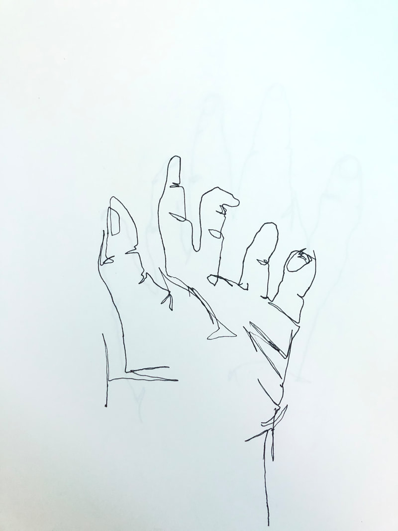
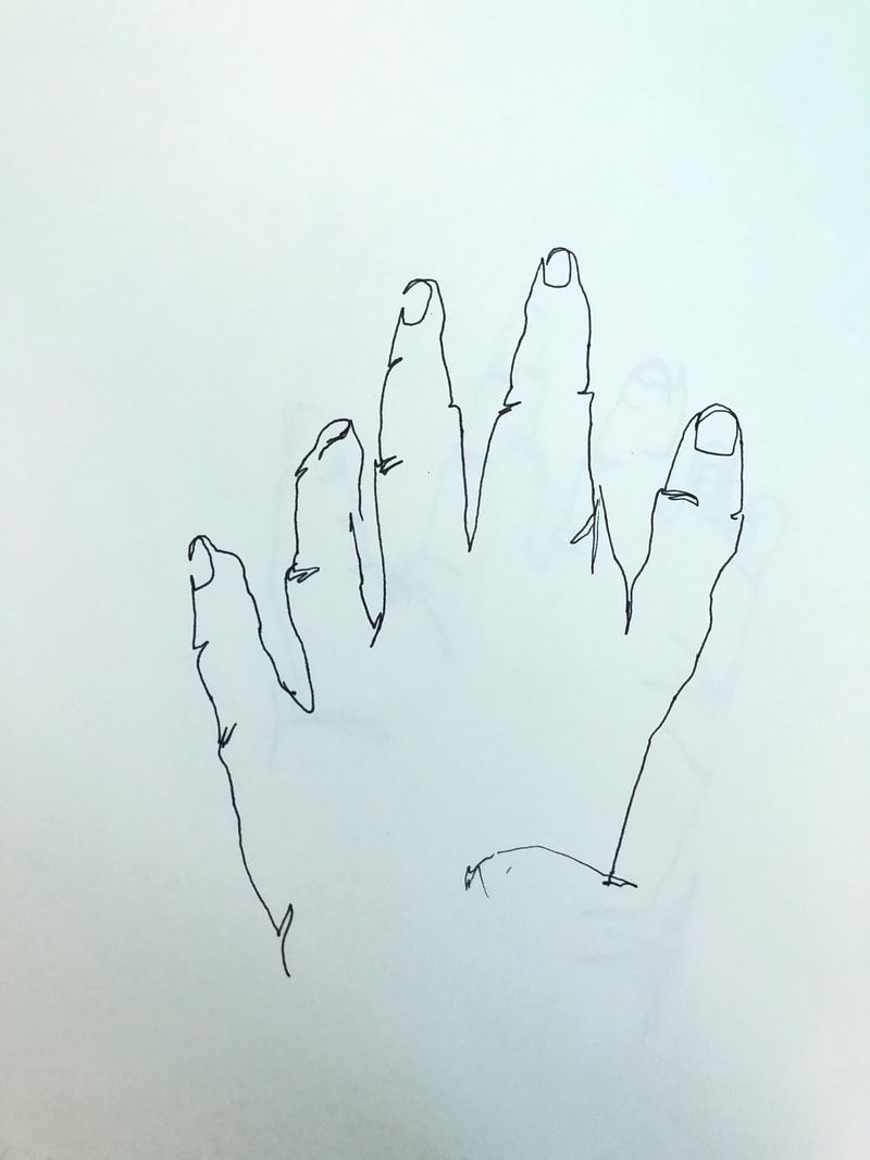
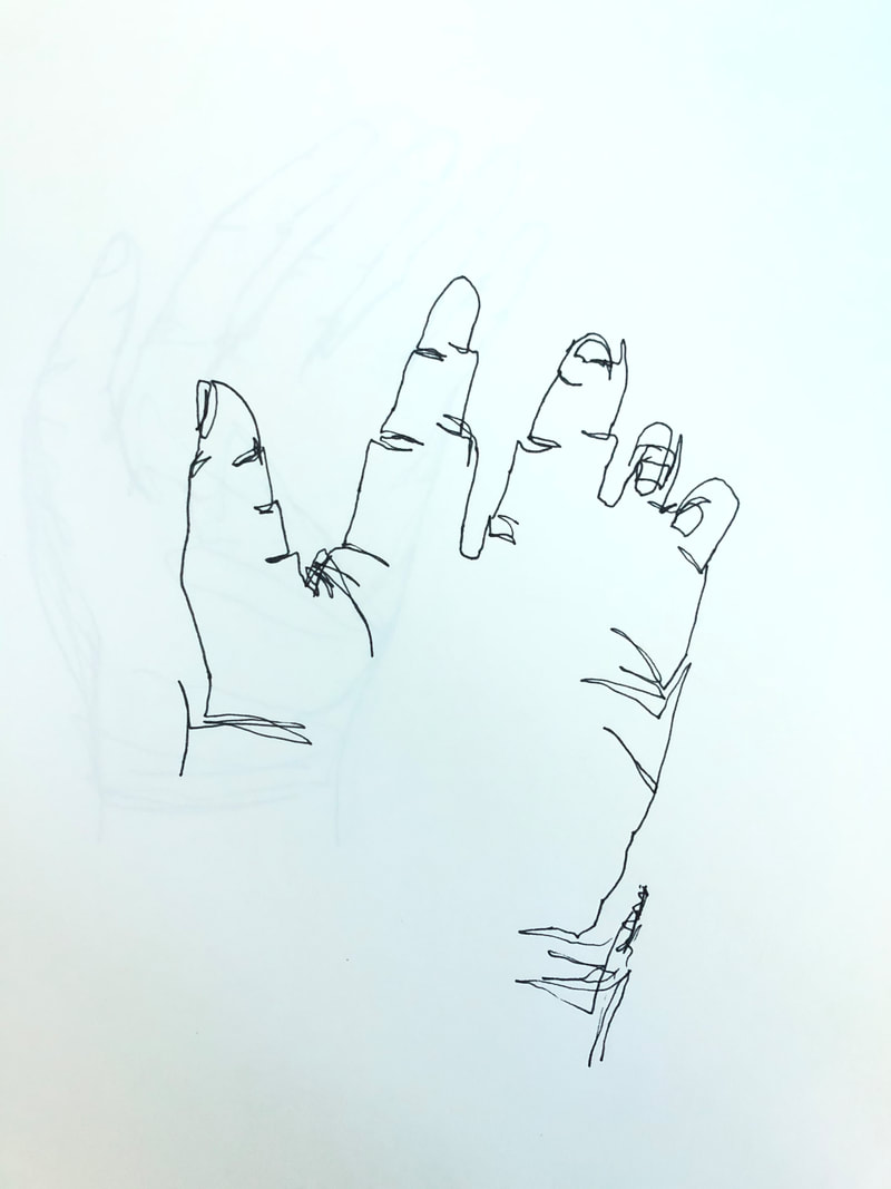
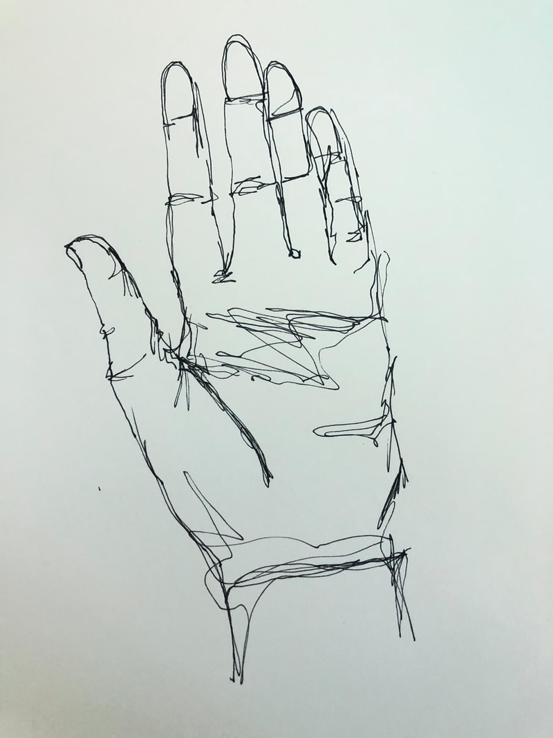
For this assignment I had to do three blind contour hand drawings in pen. We were not allowed to look at the paper our pick up or pen. Each drawing had to be done in two minutes or less. These were challenging but I felt like they got easier the more we did them. I think it was harder not being able to pick up the pen, rather than not being able to look at it. Modified Contour hand drawings
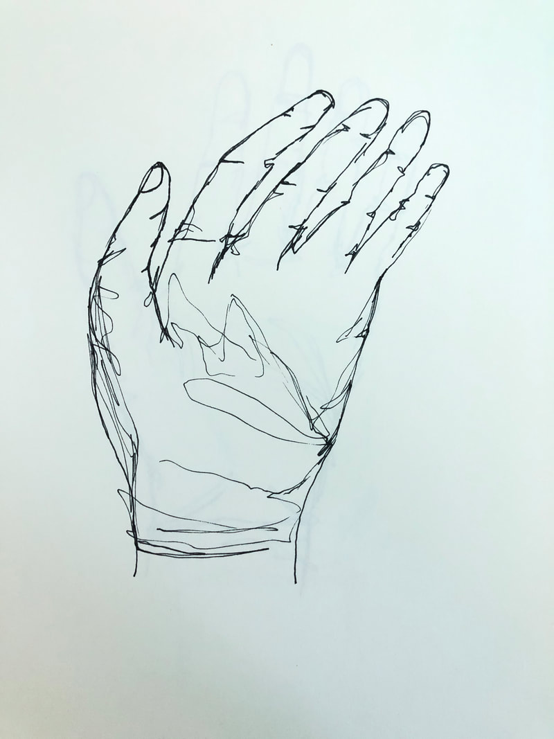
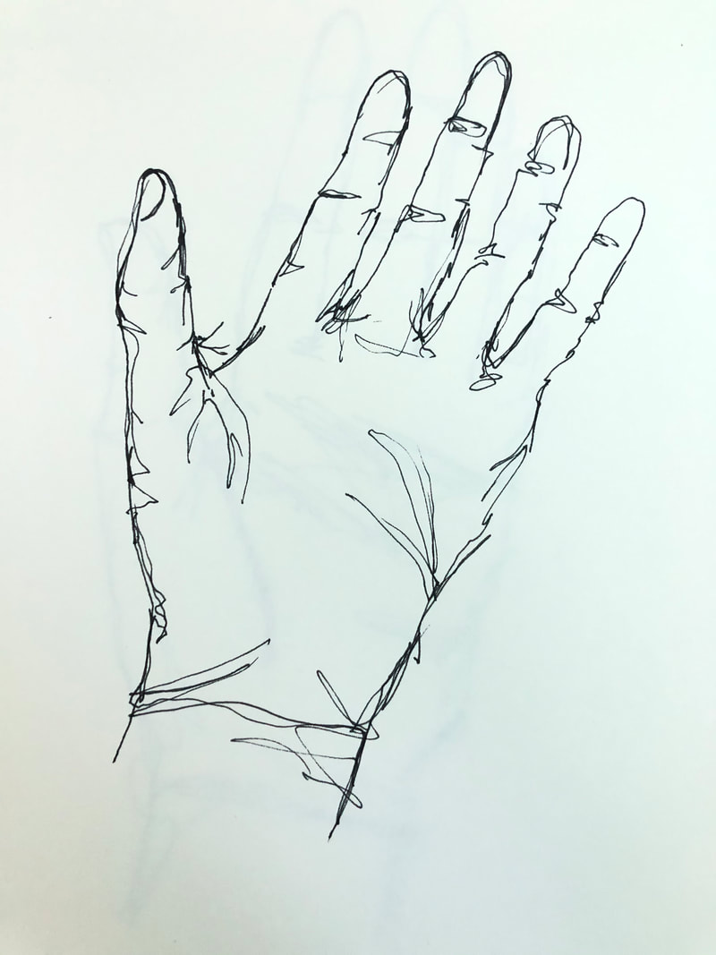
For this assignment we had to do three modified contour drawings. We were given three minutes to complete each hand, however we were not allowed to pick up our pen. We were allowed to look at the drawing this time, which made the drawing much easier. I think the drawings became more realistic and proportional the more I practiced. Notes
Modified contour backpack and shoe
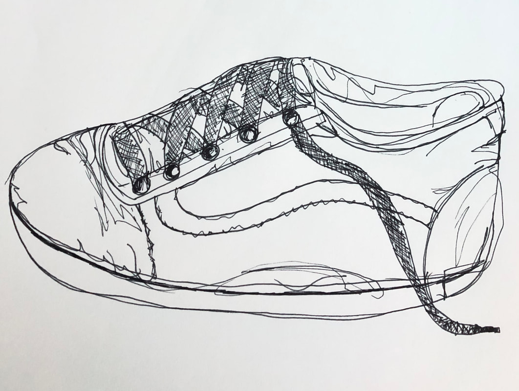
For this assignment, we had to do a modified contour drawing of a backpack and a shoe. We could only use pen and we were not allowed to lift it from the paper. For the backpack I drew in all of the folds and stitching that is on the backpack, and added in the logo and the patterned design. For the shoe, I drew all the creases and stitching as well as the cross stitch pattern that makes up the laces. White value chart and sphere on black paper
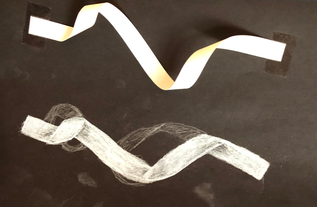
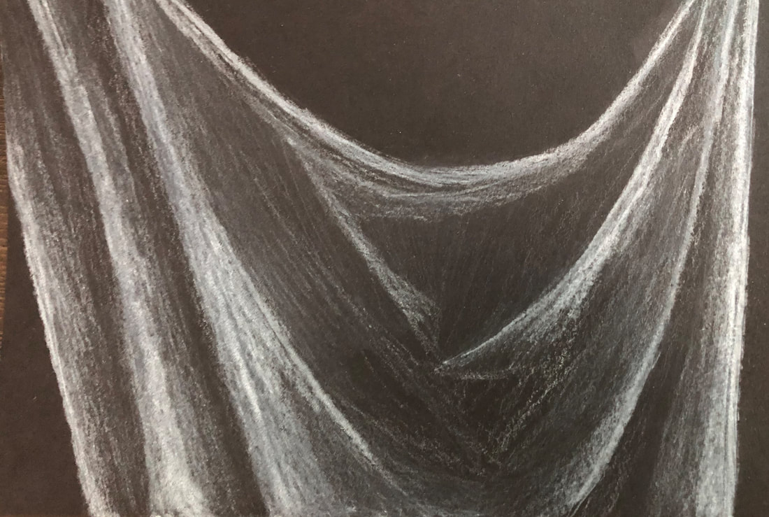
White ribbon drawing
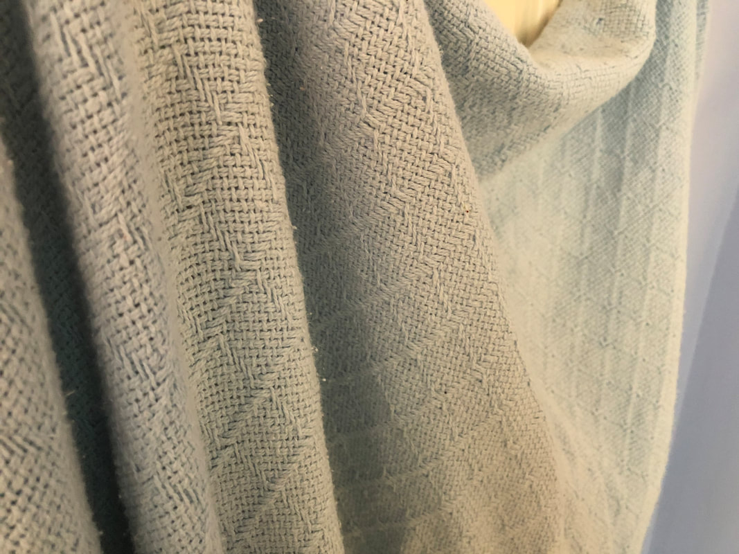
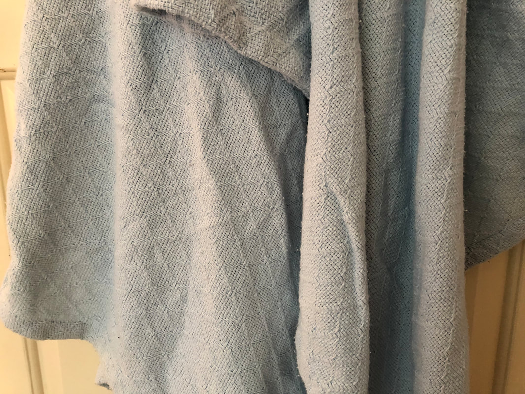
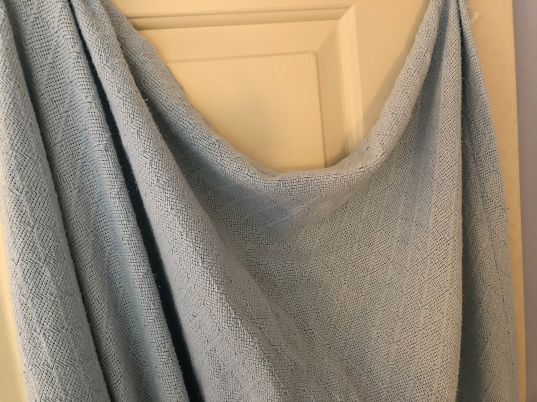
FabricREFERENCE photos
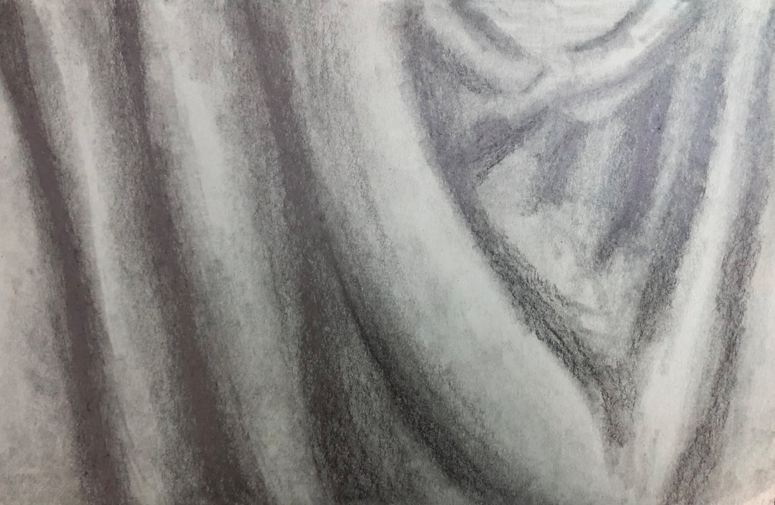
fabric drawings
For this assignment we had to set up a piece of fabric, and find good compositions within the folds. In the first drawing I used graphite pencil on a small grey piece of paper. In the second drawing I used black charcoal on a small piece of brown paper. In the third drawing I used white charcoal on a small piece of black paper. Still LifeREFERENCE Photos

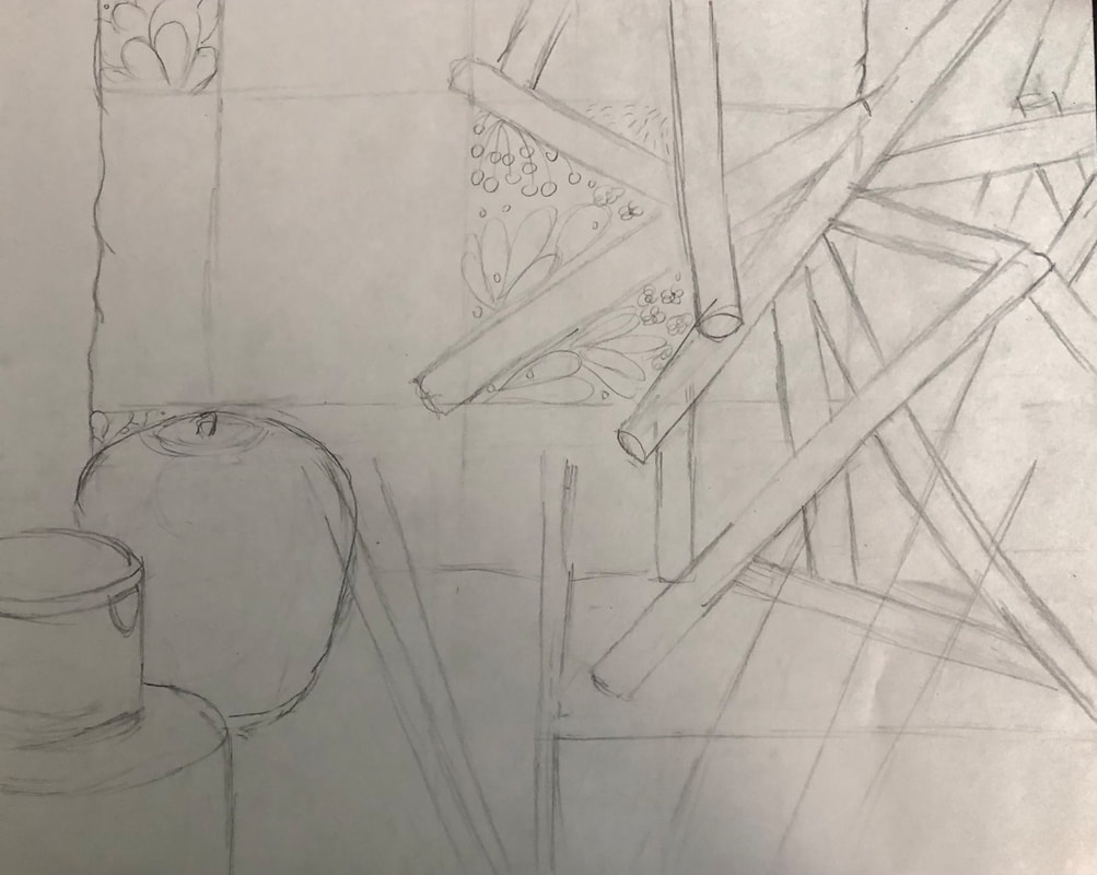
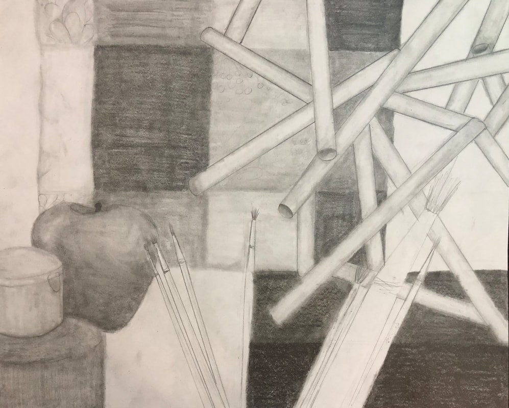
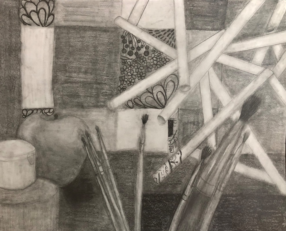
Photo of entire still Life Compositional Sketches
in progress photos
final still life drawing reflection questions1. Describe the craftsmanship of your drawing. (Is it clear, clean edges, blended well, smudges, defined space, etc.) I think my drawing is crafted very well. It is completely blended, it is clean, it is clear, and it is completely shaded. There aren't any smudges and the space is well defined. 2. Are your values and shadows realistic? How many values did you include? How and why are values important? The values and shadows are realistic, however I think the shadow coming off of the apple may be a little harsh. I included as many values as I could, utilizing the lightest shade and the darkest shade I could create. Values are important because they help add a sense of depth and perception, as well as making a more realistic looking drawing. 3. Is there a clear source of lighting? There is a clear source of lighting and this is mainly be seen in the highlights and shadows of the apple. 4. How important were the compositional sketches? Explain. I think the compositional sketches were very important. They really helped me when it came to the proportions of the final drawing. I also think that doing the compositional sketches made it easier to create the final drawing, since we had already done a practice version of it. The compositional sketches also helped when it came to deciding which viewpoint would look best for the final drawing. 5. How is your final drawing successful? My final drawing is successful because I showed all the value in the image, as well as the detail in all the objects. It is completely blended and I have the highlights and shadows in the proper places. 6. Are the proportions, structure and perspective of the subject correct? The proportions are all correct in the drawing, however I think the paintbrushes could have been a little bigger. The structure and perspective of the subject is all accurate according to the image of the still life. 7. Does the placement & grouping of objects create a pleasing arrangement (composition)? I think the placement and grouping of the objects creates a pleasing arrangement. The final drawing was of the image with best composition found through the viewfinder and I think this is evident in the drawing. 8. Is there a center of interest and is it well located? I don't think there is a center of interest, my eye started at the bottom left corner with the paint bottle and then leads upward to the apple, and then to the center, then down the right side and to the paintbrushes. 9. How well did you manage your time and resources throughout the process of creating this drawing? Do you see where you could improve in this area? I think I managed my time and resources well throughout the process of creating this drawing. I worked on it a little every day until I was finished and I think that really helped me stay on time. I think I could have improved on managing my resources by getting an opinion on my drawing when I turned in my in-progress photos. 10. What challenges did you encounter during this project and how did you overcome them? I was challenged with making the drawing too dark that it was hard to see the depth and value. In order to overcome this I used less pressure overall, so my highlights became lighter, and my shadows had depth. 11. What have you learned drawing a still life? I have learned more about how to create depth in a drawing where there are a lot of objects in front of one another. This was especially difficult because a few of my objects had a lot more negative space that I was use to. I also learned more about the different values and shading in this artwork. perspective drawings1 point perspective
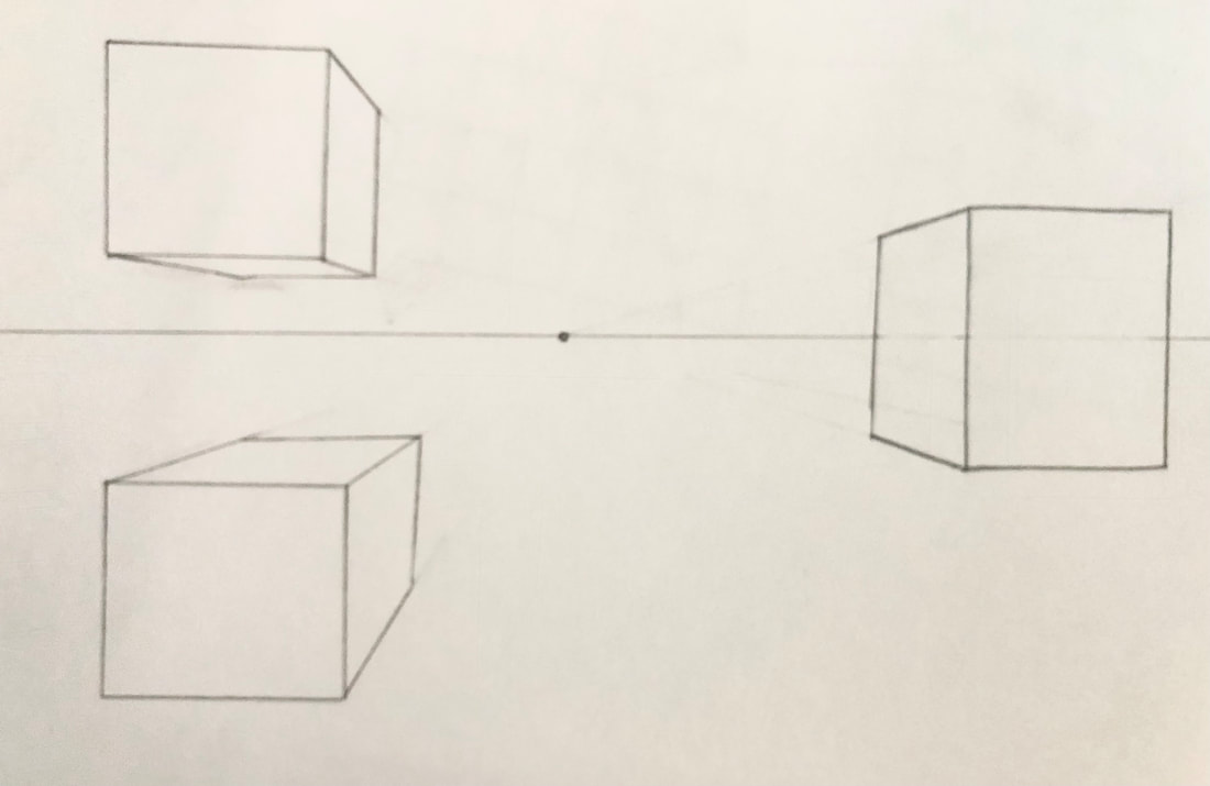
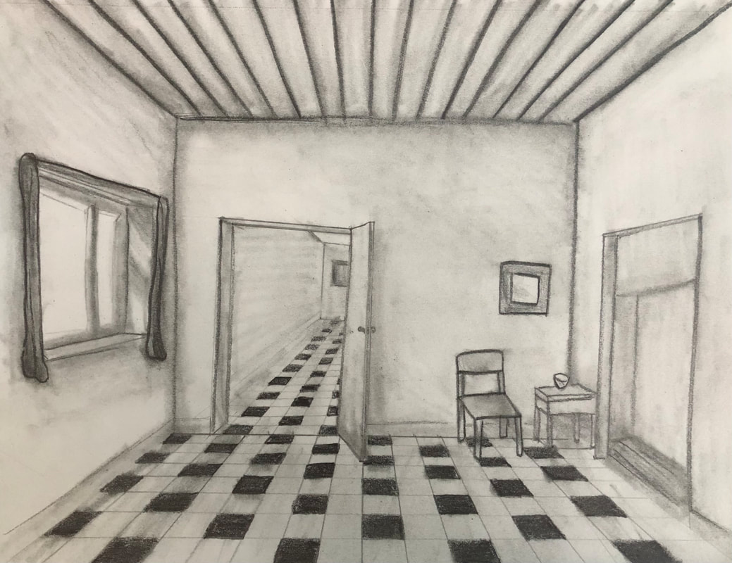
2 point perspective
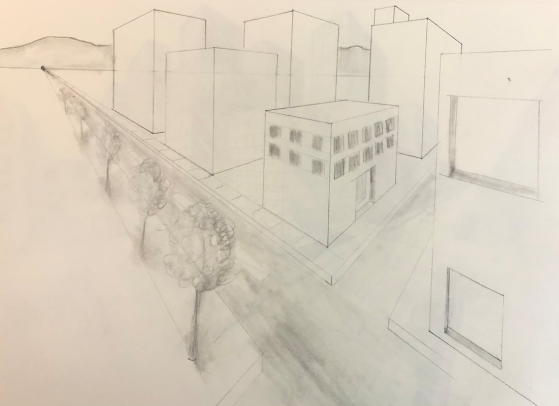
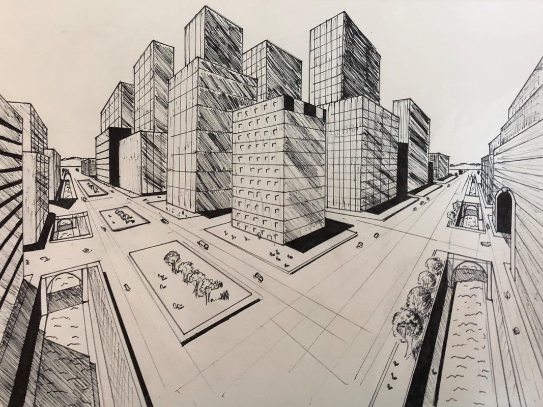
These two drawings above are the 2 point perspective drawings we did from watching the videos. The first one is more simple and shows the basic shapes of the buildings. The second one is more complex with more buildings, tunnels, rivers, and shading. The second one is also completed in pen. 3 point perspective
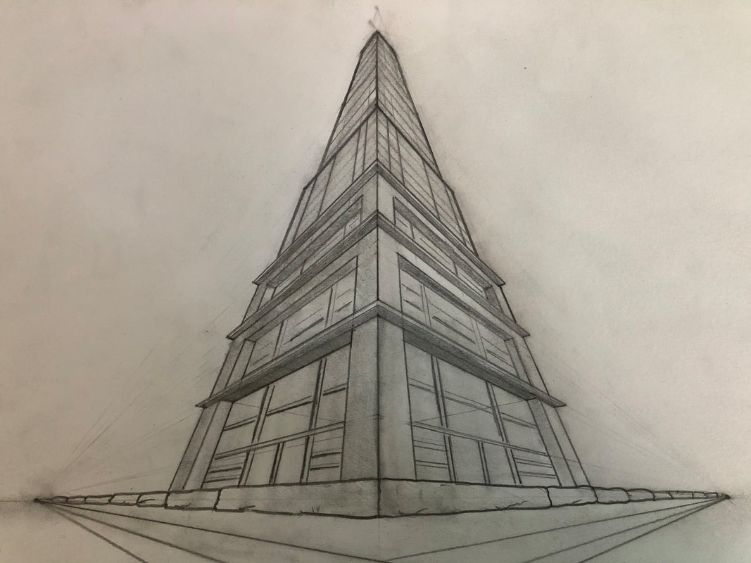
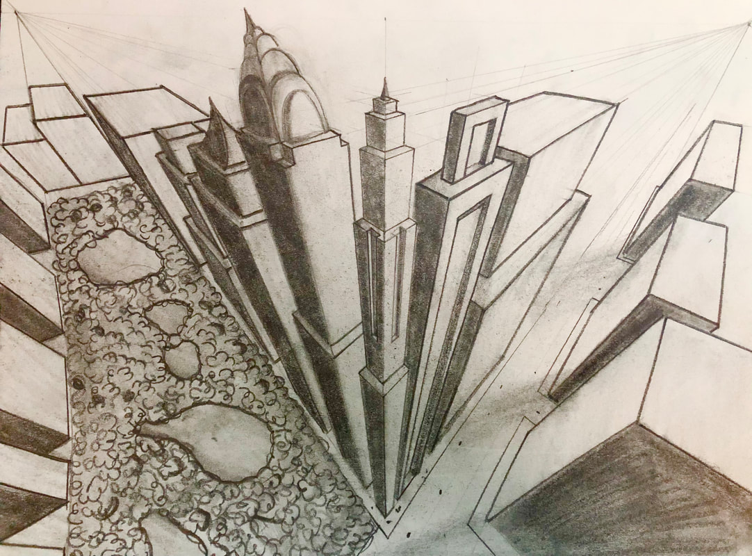
The two drawings above are the 3 point point perspective drawings we did from watching the videos. The first drawing is a 3 point perspective worms eye view, and the second is a 3 point perspective bird's eye view. Forced Perspective
Look at that viewBrainstorm ideas
REFERENCE photos: Idea 1

REFERENCE photos: idea 2

Final Sketch IN progress
Final drawing Project questions1. Describe how you created an interesting point of view? Was it successful? Why or why not? I created an interesting point of view by using an ants perspective and taking the picture looking up the tree. I think it was successful because the tree is a lot larger at the bottom, and gets smaller in the distance. 2. Why is it important to understand perspective and how to draw it? It is important to understand perspective because not everything is all on one plane, everything has depth and without an understanding of perspective it would lack the necessary depth. It is important to understand when drawing because it will help your drawing look more realistic. 3. How were the pencil and perspective exercises important in the success of your piece? Without doing the perspective and pencil exercises I would not have known how to create a realistic looking perspective. This was important to the perspective of my piece because it added a sense of length to the tree. 4. Describe the craftsmanship of your piece. What techniques were used? (How well the project is technically crafted). This piece was very well crafted. I used multiple shades of pencil to create a lot of contrast between the highlights and the shadows. I used different shading techniques to create the different shades so that there would be a sense of depth in the drawing. 5. Were you able to achieve depth by showing a foreground, middleground and background? Explain. I was able to achieve depth by showing a foreground, middleground, and background. I did this by using different values and pressure on my pencil to create depth in the drawing. 6. Explain your experience with using perspective and the project in general. What were the obstacles and advantages? I found the perspective aspect of this drawing to be a lot easier than creating the values in this drawing. At first I had made the drawing too dark, resulting in the detail in the tree being lost. I then had to erase some of the pigment off and re add the detail in. I think an advantage I had was using the grey paper instead of the white paper because it set up a nice background for my drawing. 7. Looking back on the progression of this project, what skills, techniques or other information would you like to have been taught? Do you feel you were prepared for this project? I would have liked to know how to do the detail on the tree a little better with the shading and depth involved. I feel like I was pretty well prepared to do this project and the practice perspective drawings we did really helped me in this final drawing. Colored pencil and pastelsColored pencil forms
For these colored pencil forms we had to draw three spheres and three cones. One of each shape went on a black piece of paper, a brown piece of paper, and a grey piece of paper. We had to include highlights, multiple colors, and a cast shadow. I used cool toned colors for the spheres, and warm toned colors for the cones. Colored pencil fruit
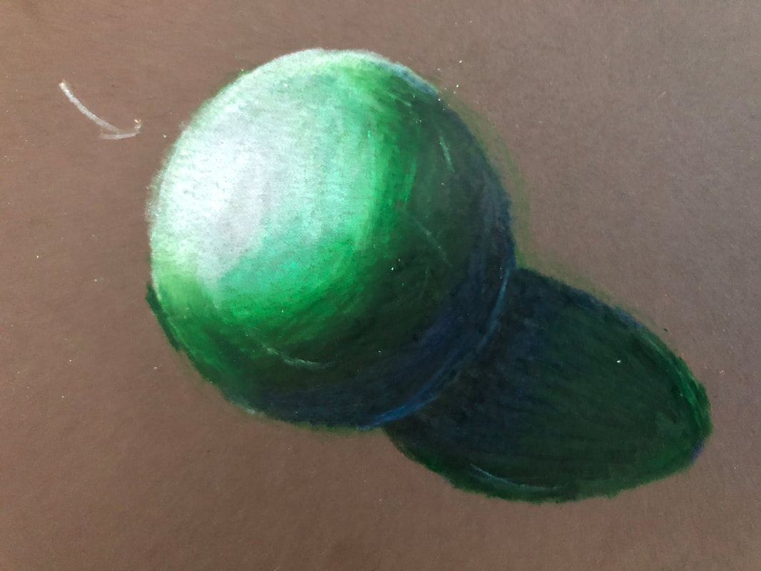
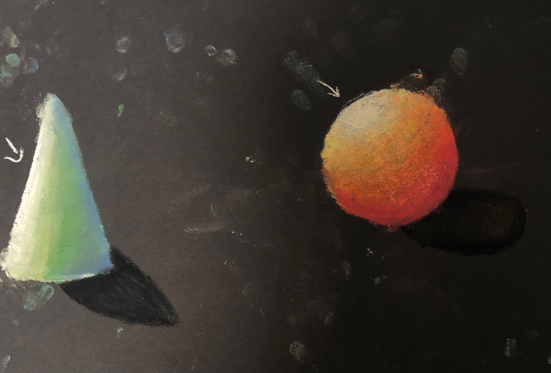
Pastel Forms
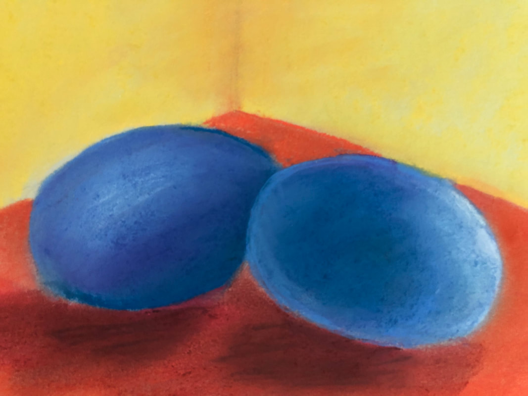
Pastel eggs
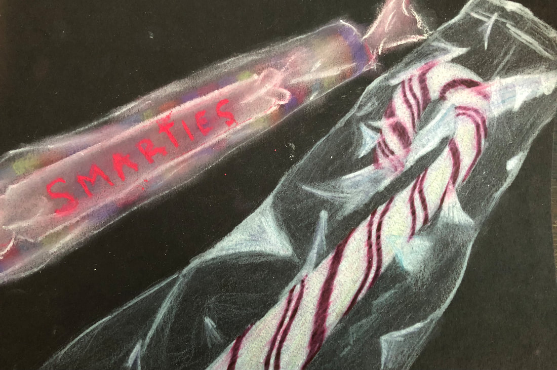
Wrapped Candy
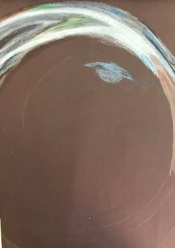
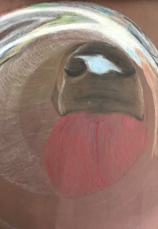
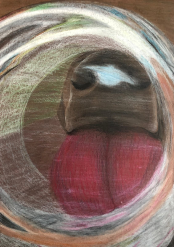
LOok what i can see throughBrainstorming
Compositional Photosidea #1

idea #2

Final sketch in progress
final drawing project questions1. Describe the craftsmanship of your drawing. (Is it neat and well executed?) This drawing is very well crafted. It is neat and well executed. 2. Describe how you created the look of transparency. I created the look of transparency by adding in highlights overtop the subject behind the glass. This gives the illusion of transparency. 3. Describe your choice of colors/color harmonies and how you used them throughout the artwork. I chose to add in a lot of different colors in this artwork. I also chose to draw this on a brown piece of paper because most of the colors seemed to have a brown undertone in the reference photo. 4. How did you create contrast in your drawing? I created contrast in my drawing by adding in dark shadows and light highlights. Allowing the colors to get darker as the subject went further back into space, created a sense of depth which also contributed to the contrast in the drawing. 5. How did you use textures, highlights and shadows to enhance your artwork? I used textures, highlights, and shadows to enhance my drawing by allowing them to help create a sense of depth to the artwork. The different textures helped create contrast, the highlights helped give the illusion of transparency, and the shadows added dimension to the drawing. 6. Discuss the importance of understanding the media (prisma or pastels) and acquiring the skills necessary to create a successful project. How beneficial were the mini assignments? The mini assignments were very beneficial when it came to blending the prisma colors together, as well as layering each color on top of one another to get a very vibrant drawing. 7. Describe any difficulties you had creating your drawing and what you could do to improve your drawing? I found it difficult to match the right colors, as well as create a more detailed background. I could improve my drawing adding in more detail to the background and the space around the subject. Facial features drawingsEyes
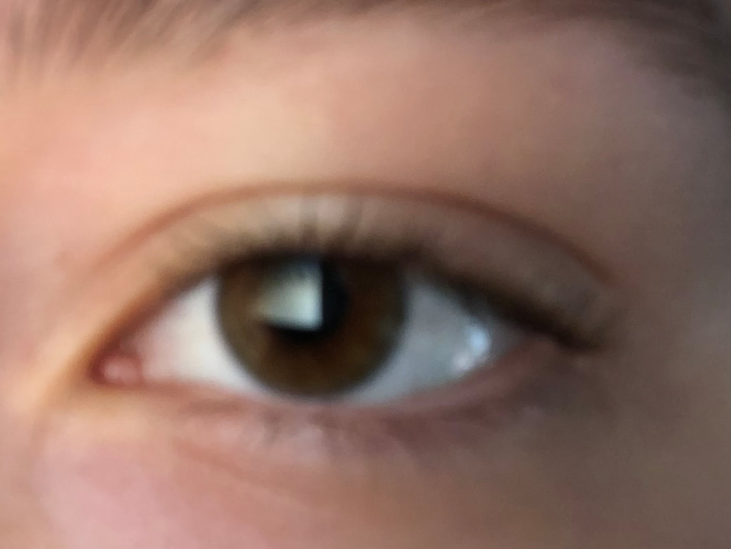
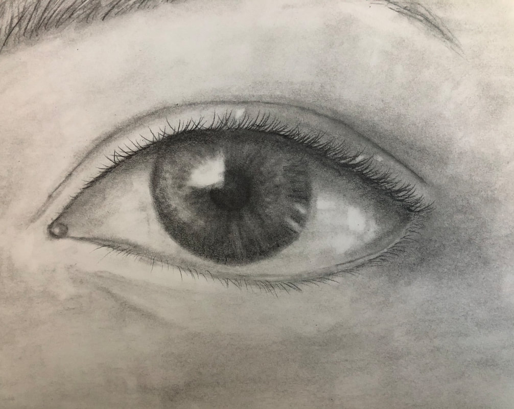
The first drawing is the practice drawing we did of the eye. The second photo is of my eye and it is the reference photo I used to draw the third and final eye drawing. Nose
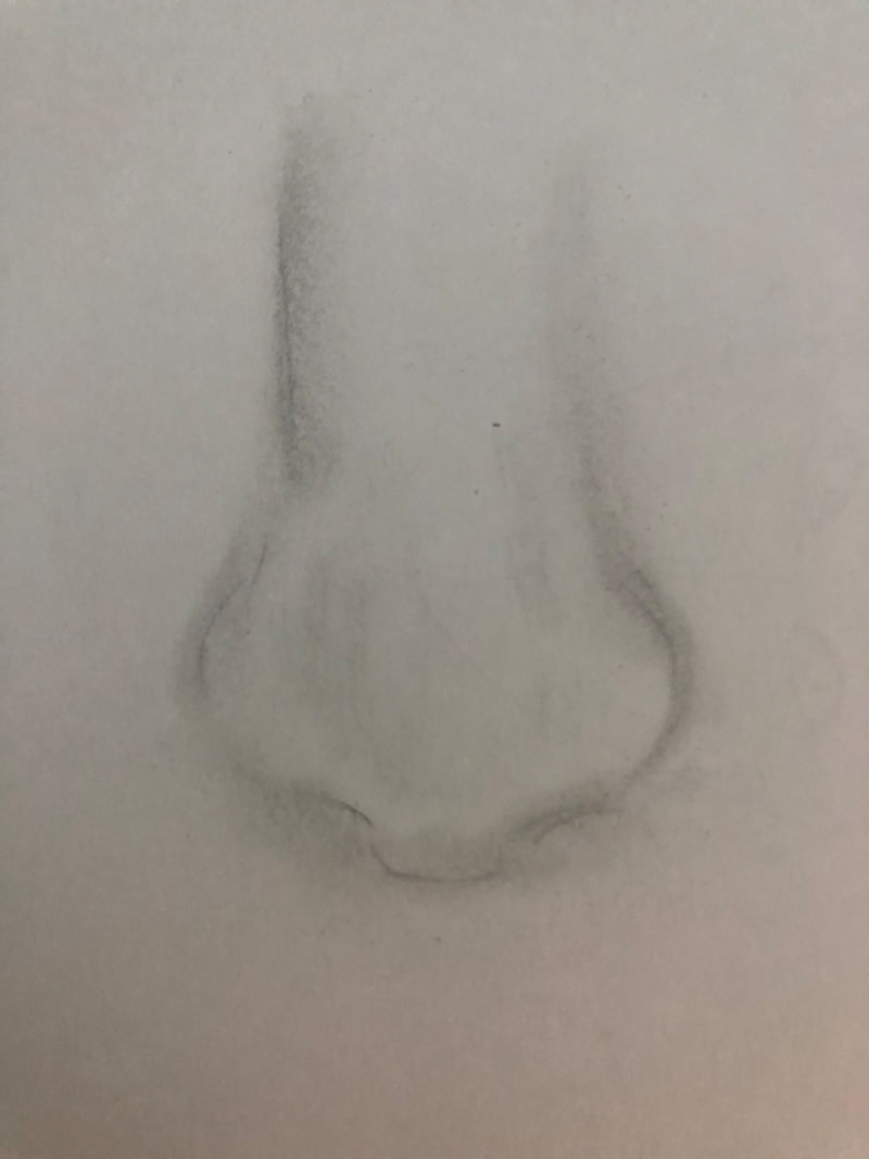
The first drawing is the practice drawing we did of the nose. The second photo is of my nose and it is the reference photo I used to draw the third and final nose drawing. mouth
The first drawing is the practice drawing we did of the mouth. The second photo is of my mouth and it is the reference photo I used to draw the third and final mouth drawing. face
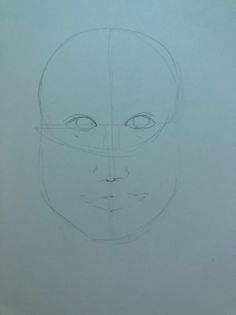
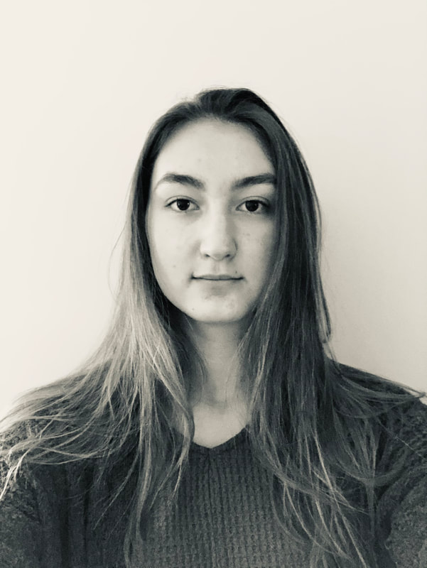
The first drawing is the practice drawing we did of the face. The second photo is of my face and it is the reference photo I used to draw the third and final face drawing. Self portrait projectBrainstorming Ideas
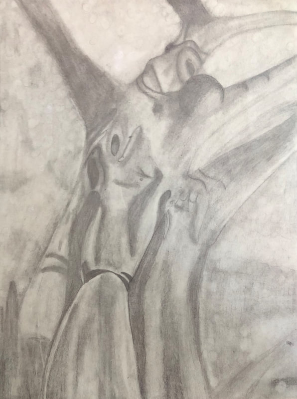
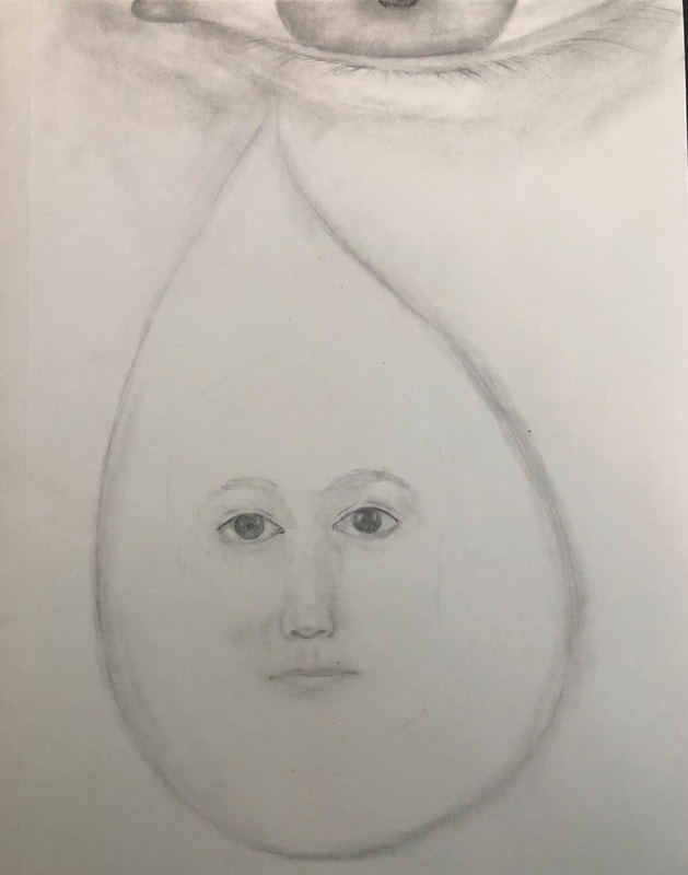
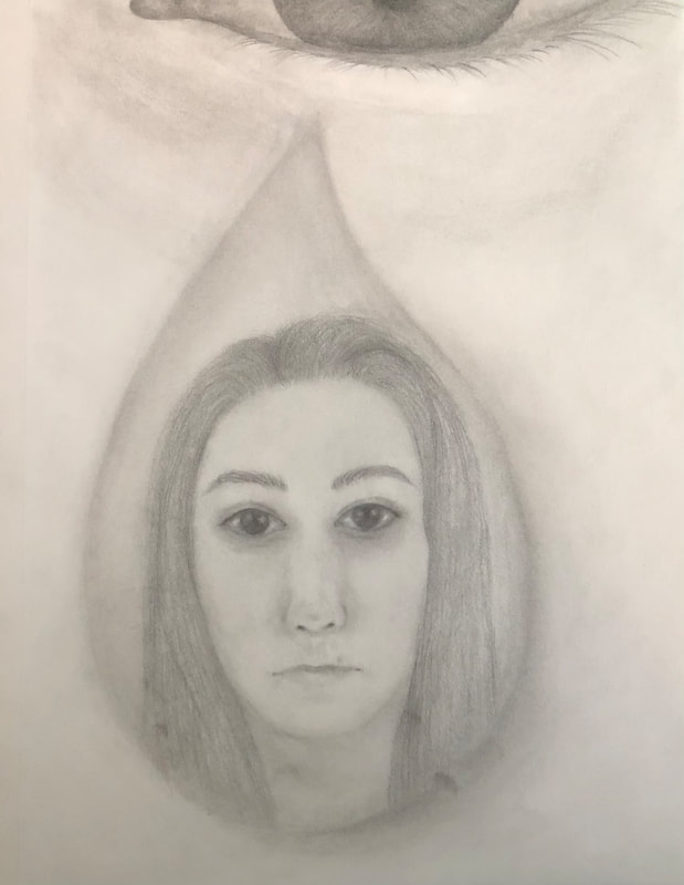
SKETCHES
In progress
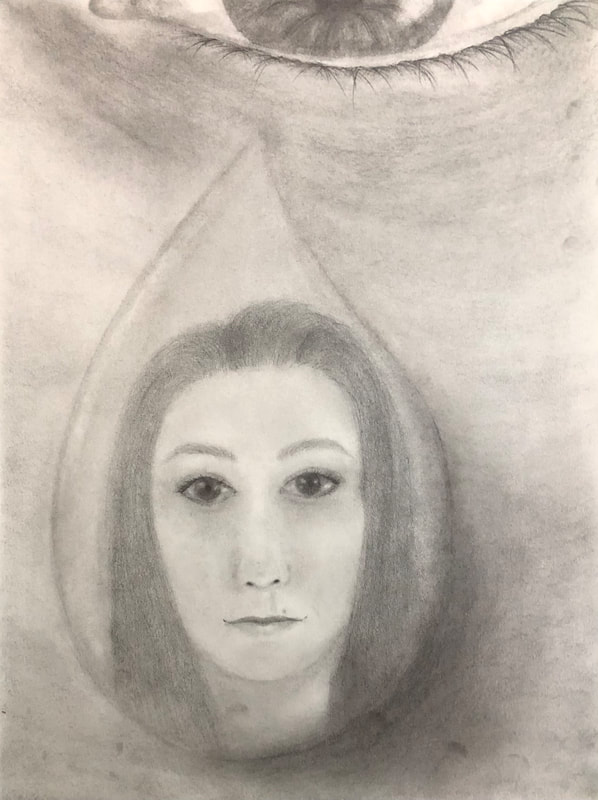
Final self portrait self evaluation questions1. Explain the process you went through to develop your drawing.
To develop my drawing I started out by making an overall sketch to get the placement for everything. After that I went by section and added details through multiple layers of graphite. Finally I worked on getting the darkest parts of my drawing as dark as they could be, and the lightest parts as light as they could be. 2. Discuss your choice of how you presented yourself (mechanical, expressive, stitched together, etc)? I presented myself in an expressive face, inside a teardrop. Originally I had planned to be in a raindrop falling from the sky, however in the compositional sketches a teardrop shape worked better. 3. Did you achieve a full range of value within your portrait? How? I did achieve full range of value within my portrait. I did this by using multiple layers of graphite and continuing to layer in dark areas while leaving highlights without pigment. 4. Describe your craftsmanship. Is the artwork executed and crafted neatly? The artwork is executed and crafted neatly. Everything is blended together so there are no harsh transitions within the graphite and highlights. 5. How were you able to capture your look? I was able to capture my look by using inspiration from multiple teardrop shaped pictures, and the overall tone of the look I was going for. 6. Explain how you made sure you had correct facial feature placement. I made sure I had the correct facial feature placement by using the eye distance measuring techniques. This ensured that I had all of my facial features in the right spot. 7. Explain the importance of learning how to draw all the features individually. It was very important for me to learn how to draw each of the facial features individually first because I could then go into detail with each feature. When all the facial features are put together each feature can become less detailed so it was important to know how to draw a detailed feature before we put them together. 8. What part of this unit was the most beneficial and why? The most beneficial part of this unit was all of the video resources that were given to us. I found these the most beneficial because I could learn in depth details specific to me for my final portrait. 9. List any obstacles you had to overcome and how you dealt with them. I struggled with creating smooth blending transitions, especially when it came to the skin. I used tissue to help with this and I created smoother transitions.
0 Comments
|